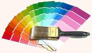
Watching paint dry can be more exciting than you think – if you re on trend.
Here s a range of colour forecasts for 2015 from those in the know.
Resene Paints says trends have come around to perennial favourites –
deep blue reds, the striking tone of black and near black, the soothing restfulness of duck egg blue and greyed blues and the bold pops of orange and yellow to add a touch of upbeat liveliness.
(See resene.com.au for full colour forecast)
Sherwin Williams is forecasting four key trends.
Chrysalis: Looking to the earth and sky for inspiration with colours that create an oasis.
Voyage: From space tourism to undersea resorts, we look to beyond to find colours that are supernatural and magical.
Buoyant: Bright florals, green spaces, urban environments define the colour in this palette.
Unrestrained: From bold, ethnic-inspired colours, designs and crafts to the Bohemian lifestyle.
(See sherwin-williams.com for full colour forecast)
Dulux is focusing on four palettes.
Wildland colours showing contrast of light and dark.
Silentshift’s soft colour palette allows you to create spaces in which there is minimal pattern and contrast, inviting your mind to rest and be silent.
Modhaus is based on Memphis design of the 1980’s, with contrasting colour blocks spliced between graphic patterns, often in black and white, played against geometric shapes that repeat to create a sense of order, balancing out the colour.
Earthwerks is a palette drawn from greens and mineral hues creating spaces where mimicked or real nature blends seamlessly with future interiors.
(See dulux.com.au for full colour forecast)
Dunn Edwards’ colour palettes for 2015 include
rich, oil-paint canvas colours and deep, jewel tones reminiscent of old masters paintings to pastel-influenced post-war hues, providing backdrop to 1950’s-influenced design. Bright pops of colour weave story lines of global travel and the best of science and technology.
(See dunnedwards.com for full colour forecast)
Benjamin Moore’s colour of the year is Guilford Green.
It’s a neutral that’s natural. A silvery green that works with everything. Go monochromatic. It’s what feels right, right now. Try warm, cool, dark and light layers of the same hue.
It’s one chromatic concept, gracefully flowing from room to room.
(See benjaminmoore.com for full colour forecast)
We won’t make the colour decisions for you but we will give you the right way to strucure your finances to cover the costs of your renovations.


